GlyMed+ Skincare
Powerful MEDICALLY BACKED Skincare with an all new identity that is just as beautiful as it is FUNCTIONAL
GlyMed+ Skincare
BRAND IDENTITY + PACKAGING DESIGN
Empowering
Crisp
Innovative
OVERVIEW
GlyMed + is an award-winning skincare brand that makes products for dermatologists, doctors and estheticians. Their products are made with botanical ingredients and pharmaceutical-grade potency. GlyMed + products are cruelty-free, vegan-approved, and environmentally conscious. With over 40 years of industry leading experience, the B2B brand underwent a large rebrand that was rolled out to the entire line of medically grade, professional strength skincare line in 2024. With a focus on improving overall skin health, GlyMed + products are designed to treat a variety of skin concerns, including fine lines, wrinkles, and hyperpigmentation.
The visual identity was designed specifically with the product packaging in mind — powerfully showcasing on the shelf at a dermatologist office to the end-user’s bathroom vanity. It was important to create a product that customers were just as proud to display as they were to use. Reflective in the design is the clean, crisp and scientific focus of the brand delivering real results to customers. We created a color-code step system based on GlyMed +’s 4-Step skincare process that created a functional, and beautiful user experience. Finally, the typographic system developed for GlyMed + featured a prescriptive focus that spoke to the medically-backed formulations.
This project was created in partnership with BLVR.
LOCAtiON
PROVO, UT
CREDITS
CReATION DIRECITON: BLVR
PHOTOGRAPHY: AUDREY FRETZ, JOCELYN MORALES
Saint Hackney
Display Serif inspired by the work of architect JOHN PAWSON and the historic Restoration of Saint John at Hackney
Saint Hackney
FONt DESIGN
Renewal
Transitional
Architectural
OVERVIEW
Saint Hackney is the newest display serif typeface from LB Type, drawing inspiration from the architectural restoration of Saint John at Hackney Church in East London by John Pawson. This elegant typeface bridges classical and contemporary design elements, featuring characteristics of both Transitional and Modern serif classifications, similar to historical typefaces like Baskerville and Bodoni.
Available in six carefully crafted weights from Light to Black, Saint Hackney demonstrates exceptional versatility across large and medium-sized applications. The typeface's high contrast between thick and thin strokes creates a dramatic interplay of light and shadow, reflective in the architectural principles of its namesake highlighting the delicate balance between preservation and renewal. This contrast is particularly evident in Saint Hackney’s heavier weights echoing Modern serif conventions reminiscent of Didot and Bodoni, while its lighter weights maintain clarity and sophistication with an emphasis on functionality.
Distinguished by several unique characteristics, including its distinctive 'R' tail and Old Style-inspired lowercase 'a', Saint Hackney’s design philosophy mirrors Pawson's 2019 restoration of Saint John at Hackney Church, where nineteenth-century architectural elements harmoniously coexist with contemporary interventions. Similarly, Saint Hackney bridges historical and modern typographic elements, presenting itself as a typeface that feels both timeless and contemporary. As intended through the architectural restoration, the emphasis on functional beauty, multi-purpose use and reviving a space for community and sound to flourish, Saint Hackney’s letterforms similarly provide a versatile stage for various applications, making it perfectly suited for editorial design, branding, and creative installations where both heritage and modernity shall coexist.
Visit the Foundry and learn more about Saint Hackney here!
DESIGN & PRODUCTION
LB TYPE — THE FOUNDRY
VERSION / RELEASE
1.0 — 2025
CREDITS
ARCHITECTURE: JOHN PAWSON Ltd
PHOTOGRAPHY: Gilbert McCarragher, Jason Orton
FEATURES
– 391 glyphs
– Set of Alternate Characters
– Western, Central, and South Eastern European characters
– Comprehensive language support
– Numericals, currency symbols, punctuation, accent characters
WORDS ABOut THE PROJECT
"The vision driving the refurbishment of this east London church was always of a ‘Cathedral of Creativity’, where architecture and people can come together in the richest ways possible, for a variety of purposes and activities, sacred and secular."
JOHN PAWSON
Brood + Co.
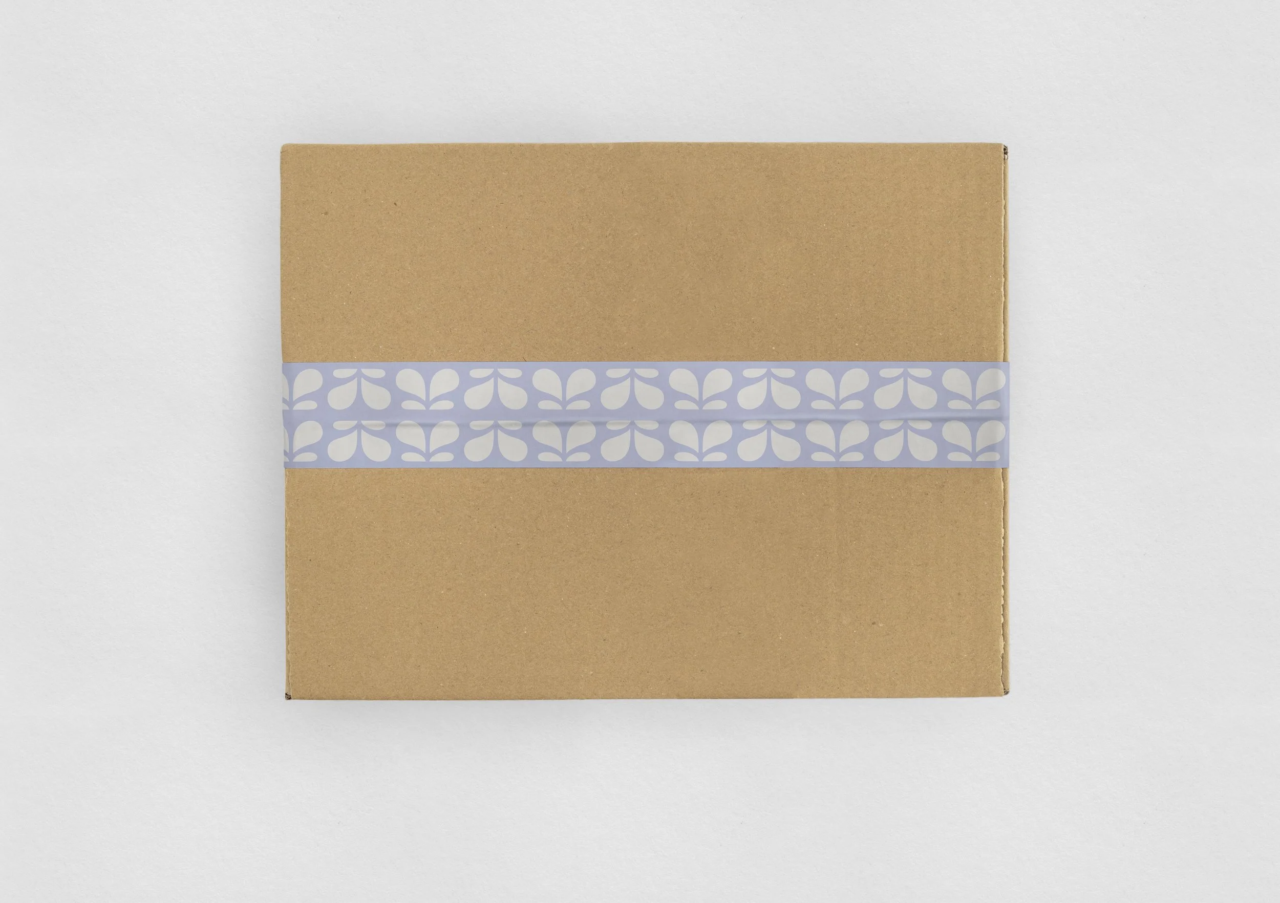
Nutrient Dense COLD BREW for breastfeeding moms to boost daily ENERGY and SUPPLY
Brood & Co.
BRAND IDENTITY + PACKAGING DESIGN
Optimistic
Stylish
Practical
OVERVIEW
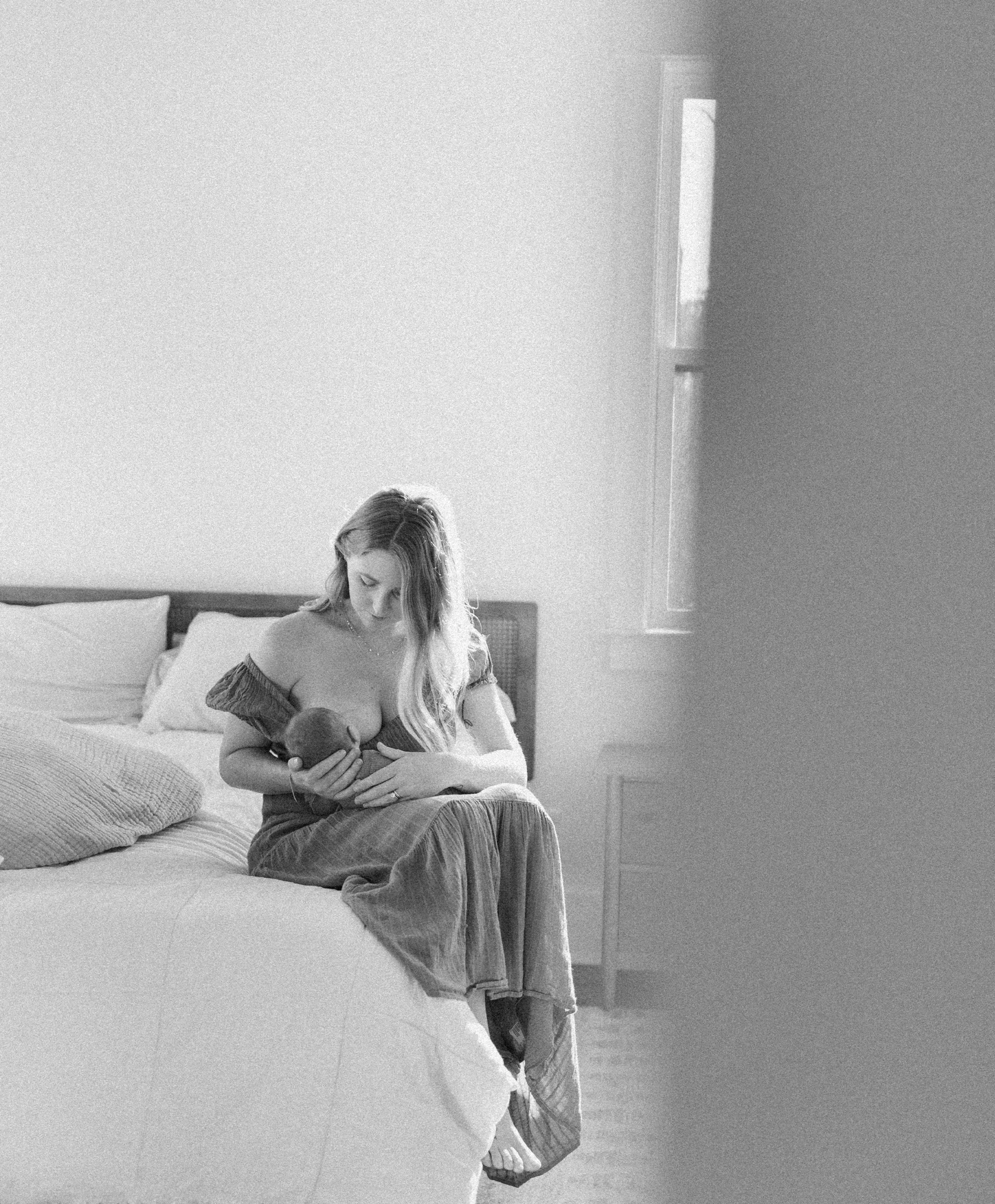
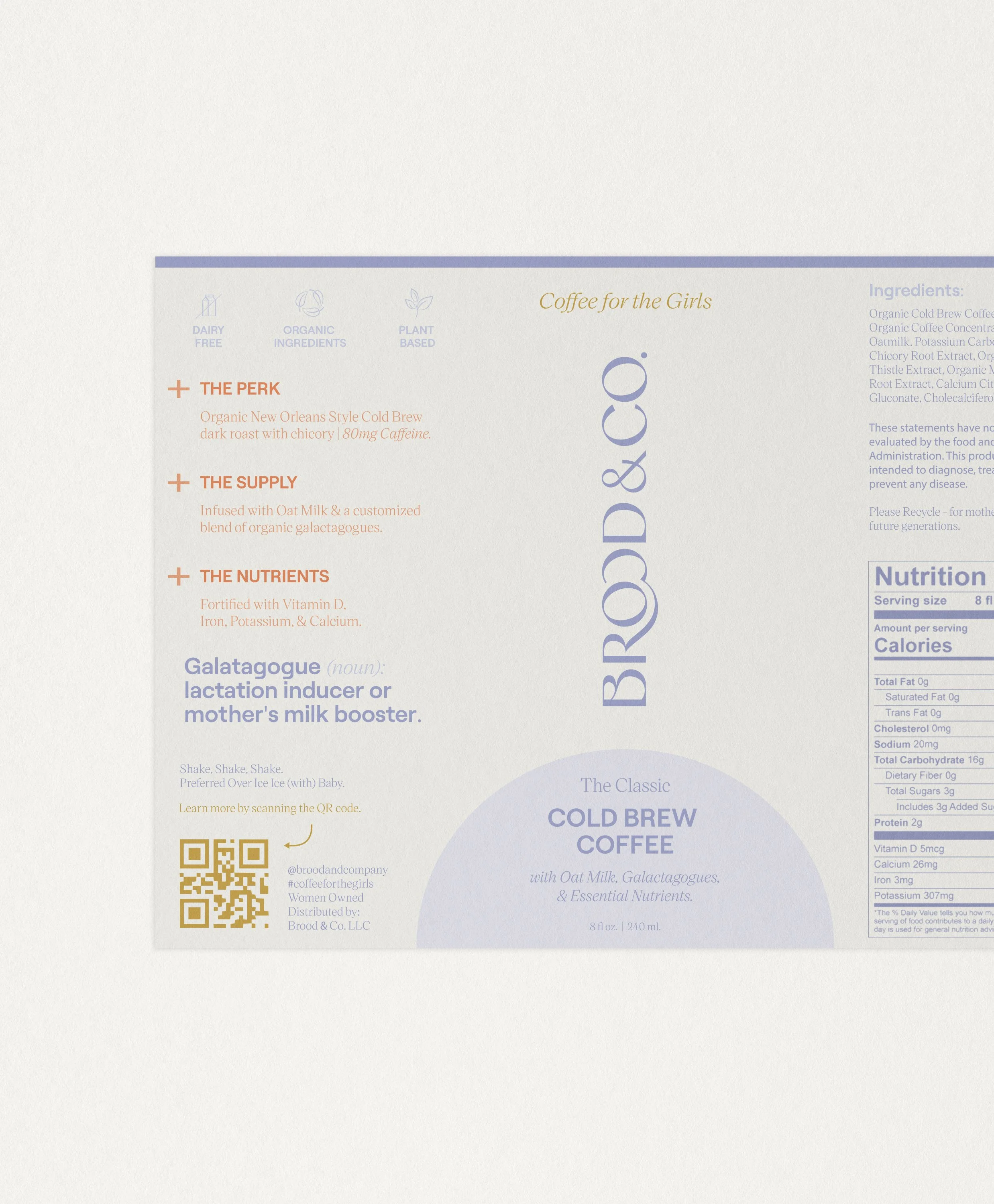
Brood & Co. is a ready to drink functional beverage that promotes lactation for breastfeeding mothers, adds a daily caffeine boost and boosts overall health. Brood & Co. believes that breastfeeding should be convenient, practical — even restful. Brood & Co.’s mission is to help mothers achieve their unique breastfeeding goals with delicious and convenient ready-to-drink functional beverages. The canned Oat Milk Cold Brew with Chicory is fortified with vitamins and nutrients targeted to increase milk supply. It’s convenient, all natural, made with organic ingredients, and packed with galactagogues to boost supply and nutritional support. Brood & Co. was designed by founder Leslie following her journey through motherhood, desiring to create a product that would fit into a new mothers lifestyle.
LOCAtiON
NEW YORK, NY
CREDITS
PhotographY: MOtHER OF WILDE
WORDS FROM THE CLIENT
“Laura is a pleasure to work with! She is open, thoughtful and creative. She is willing to flex to new requests and needs. She can execute upon a variety of aesthetics and is really thoughtful about the connection of branding to design. I cannot thank her enough for her kindness and creativity throughout the process that brought about a beautiful branding suite for my new business!”
LESLIE WEIR
Jenna & Julia Photography
Long Island’s SISTER DUO capturing love in every story, through HONEST PHOTOGRAPHY
Jenna & Julia Photography
BRAND IDENTITY + WEB DESIGN
Authentic
Raw
Romantic
OVERVIEW
Jenna & Julia Photography is a Long Island based photography brand focusing on wedding, engagement, elopements, family portraits and beyond. Learn more about Jenna & Julia Photography here. With a background in fashion and other visual languages, the sisters share a passion for details and visual storytelling seen through their work. Jenna & Julia Photography also offers a sector of work geared towards Brand Photography, Social Content, and Styled Shoots under the name The Visual Collective. The brand identity system features custom monograms, simplified marks, sub-marks and more!
Location
NEW YORK, NY
CREDITS
PhotographY: JENNA & JULIA PHOTOGRAPHY
WORDS FROM THE CLIENT
“We loved working with Laura. We have absolutely no negative feedback. Laura always made sure her process was well explained and organized. She was always so quick to respond and was always so clear what she needed from us. Whenever we hopped on meeting calls with Laura, it felt like we were on a call with a close friend who was reading our minds!”
JENNA GALLO
Concorde
The ALL-NEW vintage-style SERIF DISPLAY FONT featuring unique curves, moderate thins, and SOPHISTICATED lines with a touch of FRENCH FLAIR
Concorde
FONt DESIGN
Art Deco
Sophisticated
Vintage-Inspired
OVERVIEW
Concorde 2.0 is an elegant Contemporary serif display typeface that artfully blends influences from 1970s editorial typography with the sophisticated flair of the French Art Deco period. Concorde bridges the gap between high-contrast Modern serifs and the more restrained Transitional styles, drawing inspiration from classic French typography, with a softer, more romantic interpretation.
Originally released in 2020 as a single weight, Concorde has been meticulously remastered and expanded in 2025 into a sophisticated five-weight family ranging from Thin to Bold. This comprehensive update introduces refined details, harmonized proportions, and an extensive character set that preserves the distinctive characteristics that make Concorde unique. Concorde includes comprehensive Latin language support, carefully crafted punctuation, and a range of OpenType alternates.
The typeface's distinctive personality emerges through its thoughtfully designed alternate characters, which introduce subtle curves and flourishes to the traditional forms without compromising its core elegance. Notable features include the graceful alternate 'A' with its curved left stem and the swash-like “e”, bringing a hint of calligraphic flair and decorative elegance to the otherwise traditional structure. This system of alternates, influenced by the expressive display types of the 1970s and early 1980s, and controlled flourishes from French Art Deco posters, provides designers with the flexibility to shift between classical and more dramatic applications while maintaining sophistication. The result is a typeface that feels both historically informed and decidedly contemporary.
Concorde excels in contexts where classical refinement meets contemporary utility. Its unique blend of 1970s editorial sophistication and French Art Deco flair makes it especially effective for projects requiring both elegance and creative flexibility.
Visit the Foundry and learn more about Concorde here!
DESIGN & PRODUCTION
LB TYPE — THE FOUNDRY
VERSION / RELEASE
2.0 — 2020
FEATURES
– 392 glyphs
– Full set of Alternate Characters
– Western, Central, and South Eastern European characters
– Supports over 200+ languages
– Numericals, currency symbols, punctuation, accent characters
Alla Nostra + Co.
Mobile ITALIAN COCKTAIL Collective in NEW YORK CITY serving drinks from a VINTAGE PIAGGIO APE
Alla Nostra + Co.
BRAND IDENTITY + PACKAGING DESIGN
Modern
Sophisticated
Authentically Italian
OVERVIEW
My task for this project was to create a custom brand identity for Alla Nostra + Co. — a mobile Italian prosecco + cocktail collective in the New York City area. Alla Nostra + Co. features novelty Italian cocktails crafted by hand, inspired by vintage details, textures and all things Italian. Serving the most unique and classic drinks with an updated twist, Alla Nostra + Co. creates an incredibly unique experience serving cocktails from a vintage Italian Piaggio Ape. Learn more about Alla Nostra + Co. here!
Alla Nostra + Co’s brand identity design was rooted in classic Italian design with a modern and fresh twist. The brand identity system features a custom marble illustration, vintage inspired icons, and a custom hand-lettered wordmark.
Location
NEW YORK, NY
CREDITS
PhotographY: JENNA & JULIA PHOTOGRAPHY
WORDS FROM THE CLIENT
“Working with Laura was a complete dream. I hesitated to invest in a professional Branding package because these days there are so many “hacks” to get the aesthetic I wanted, but I’m so thankful I chose to work with her studio. She exceeded my expectations 11 out of 10. My new branding and Style Guide has been the foundation of my new website, social media overhaul, and future of my business. Laura has an incredible eye and style and the ability to take feedback to create my vision as well. It turned out better than I could have dreamed.”


