
Saint Hackney
Display Serif inspired by the work of architect JOHN PAWSON and the historic Restoration of Saint John at Hackney
Saint Hackney
FONt DESIGN
Renewal
Transitional
Architectural

OVERVIEW
Saint Hackney is the newest display serif typeface from LB Type, drawing inspiration from the architectural restoration of Saint John at Hackney Church in East London by John Pawson. This elegant typeface bridges classical and contemporary design elements, featuring characteristics of both Transitional and Modern serif classifications, similar to historical typefaces like Baskerville and Bodoni.
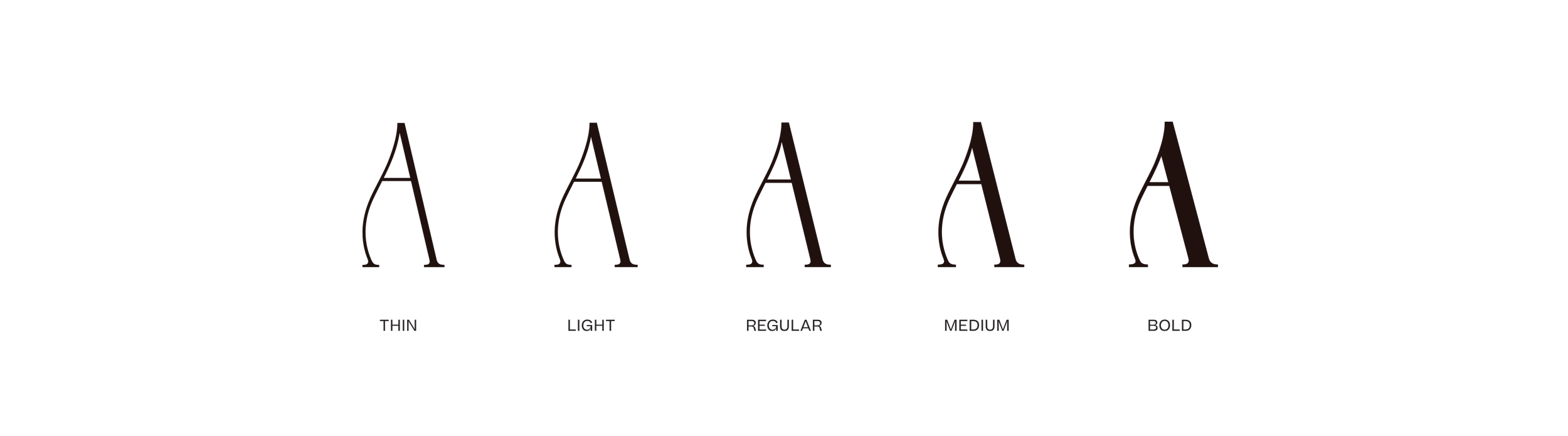
Available in six carefully crafted weights from Light to Black, Saint Hackney demonstrates exceptional versatility across large and medium-sized applications. The typeface's high contrast between thick and thin strokes creates a dramatic interplay of light and shadow, reflective in the architectural principles of its namesake highlighting the delicate balance between preservation and renewal. This contrast is particularly evident in Saint Hackney’s heavier weights echoing Modern serif conventions reminiscent of Didot and Bodoni, while its lighter weights maintain clarity and sophistication with an emphasis on functionality.
Distinguished by several unique characteristics, including its distinctive 'R' tail and Old Style-inspired lowercase 'a', Saint Hackney’s design philosophy mirrors Pawson's 2019 restoration of Saint John at Hackney Church, where nineteenth-century architectural elements harmoniously coexist with contemporary interventions. Similarly, Saint Hackney bridges historical and modern typographic elements, presenting itself as a typeface that feels both timeless and contemporary. As intended through the architectural restoration, the emphasis on functional beauty, multi-purpose use and reviving a space for community and sound to flourish, Saint Hackney’s letterforms similarly provide a versatile stage for various applications, making it perfectly suited for editorial design, branding, and creative installations where both heritage and modernity shall coexist.
Visit the Foundry and learn more about Saint Hackney here!
DESIGN & PRODUCTION
LB TYPE — THE FOUNDRY
VERSION / RELEASE
1.0 — 2025
CREDITS
ARCHITECTURE: JOHN PAWSON Ltd
PHOTOGRAPHY: Gilbert McCarragher, Jason Orton


FEATURES
– 391 glyphs
– Set of Alternate Characters
– Western, Central, and South Eastern European characters
– Comprehensive language support
– Numericals, currency symbols, punctuation, accent characters
WORDS ABOut THE PROJECT
"The vision driving the refurbishment of this east London church was always of a ‘Cathedral of Creativity’, where architecture and people can come together in the richest ways possible, for a variety of purposes and activities, sacred and secular."
JOHN PAWSON


Concorde
The ALL-NEW vintage-style SERIF DISPLAY FONT featuring unique curves, moderate thins, and SOPHISTICATED lines with a touch of FRENCH FLAIR
Concorde
FONt DESIGN
Art Deco
Sophisticated
Vintage-Inspired
OVERVIEW
Concorde 2.0 is an elegant Contemporary serif display typeface that artfully blends influences from 1970s editorial typography with the sophisticated flair of the French Art Deco period. Concorde bridges the gap between high-contrast Modern serifs and the more restrained Transitional styles, drawing inspiration from classic French typography, with a softer, more romantic interpretation.
Originally released in 2020 as a single weight, Concorde has been meticulously remastered and expanded in 2025 into a sophisticated five-weight family ranging from Thin to Bold. This comprehensive update introduces refined details, harmonized proportions, and an extensive character set that preserves the distinctive characteristics that make Concorde unique. Concorde includes comprehensive Latin language support, carefully crafted punctuation, and a range of OpenType alternates.
The typeface's distinctive personality emerges through its thoughtfully designed alternate characters, which introduce subtle curves and flourishes to the traditional forms without compromising its core elegance. Notable features include the graceful alternate 'A' with its curved left stem and the swash-like “e”, bringing a hint of calligraphic flair and decorative elegance to the otherwise traditional structure. This system of alternates, influenced by the expressive display types of the 1970s and early 1980s, and controlled flourishes from French Art Deco posters, provides designers with the flexibility to shift between classical and more dramatic applications while maintaining sophistication. The result is a typeface that feels both historically informed and decidedly contemporary.
Concorde excels in contexts where classical refinement meets contemporary utility. Its unique blend of 1970s editorial sophistication and French Art Deco flair makes it especially effective for projects requiring both elegance and creative flexibility.
Visit the Foundry and learn more about Concorde here!
DESIGN & PRODUCTION
LB TYPE — THE FOUNDRY
VERSION / RELEASE
2.0 — 2020


FEATURES
– 392 glyphs
– Full set of Alternate Characters
– Western, Central, and South Eastern European characters
– Supports over 200+ languages
– Numericals, currency symbols, punctuation, accent characters