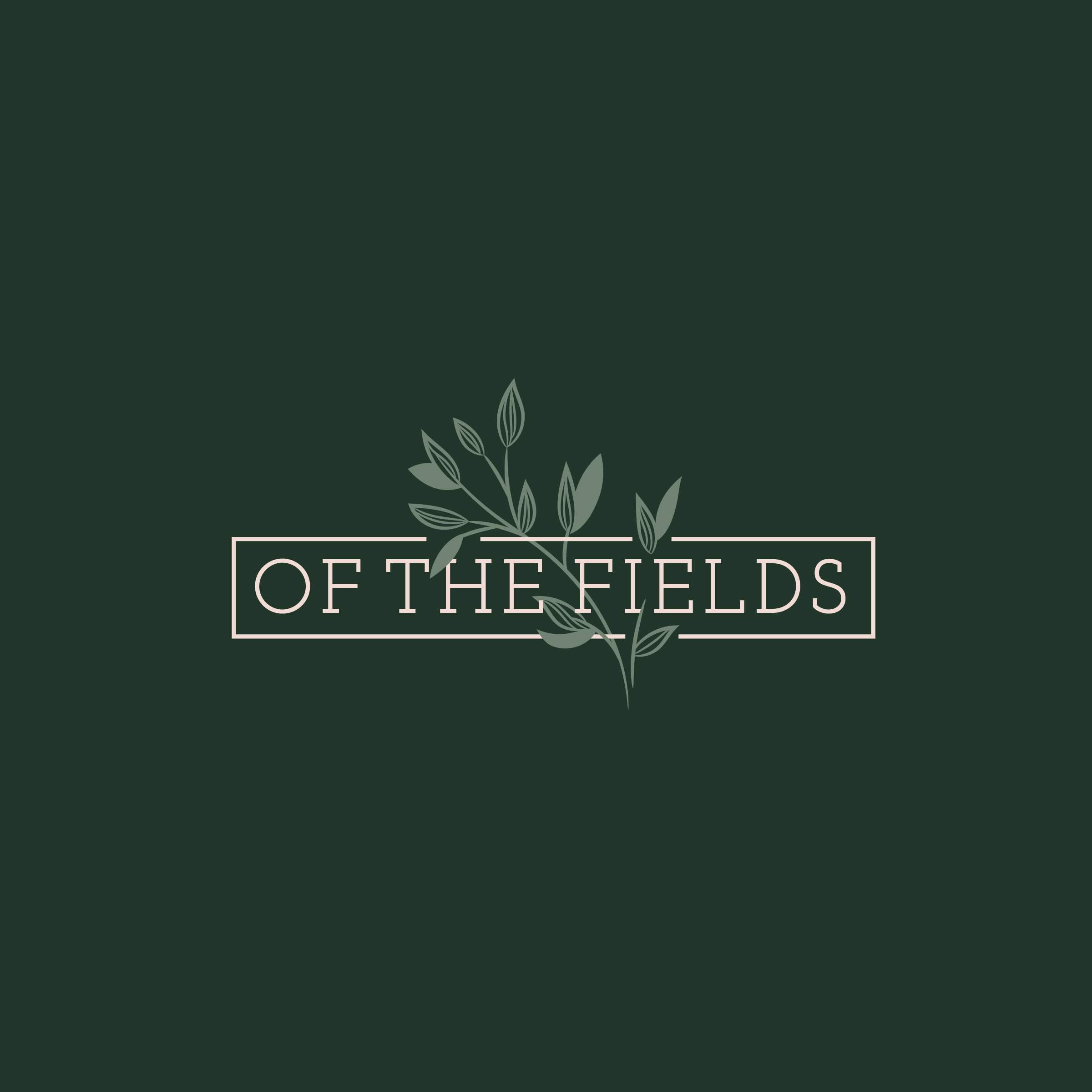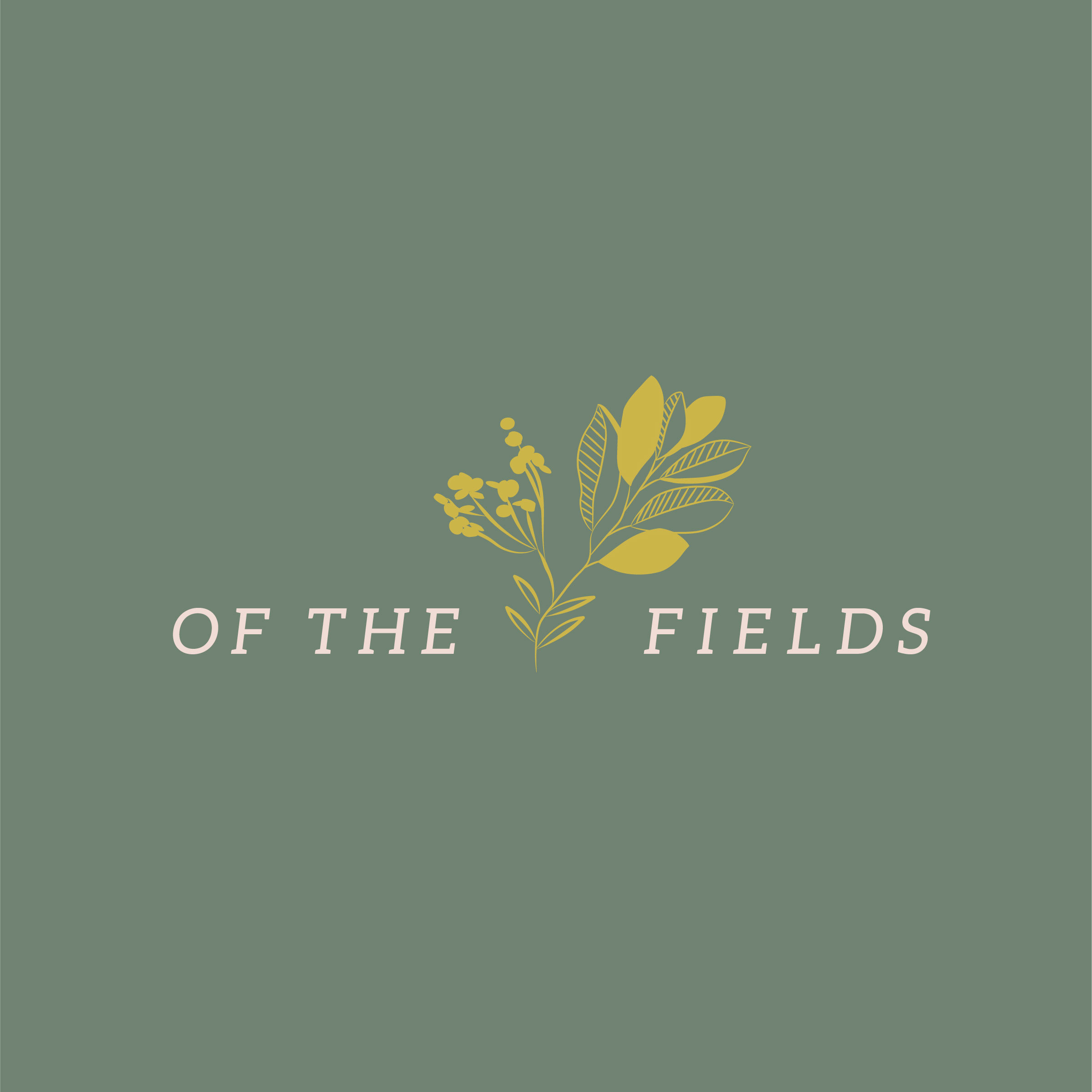
This logo was created for a client based in Nashville, TN in development with their new Floral Arrangement business. The passion and vision behind the brand Of the Fields Floral stemmed from childhood memories of picking wildflower bouquets. I worked with the client to visually display their ideas into a concise design direction for branding. Honing in on handmade, clean, mature design, with a hint of whimsy and personalization we focused on a natural, earth based color palette. I presented the client with various concept to choose from, narrowing it down to one final mark featured custom illustration and unique logotype shown below!


Design Development + Trend Ideation
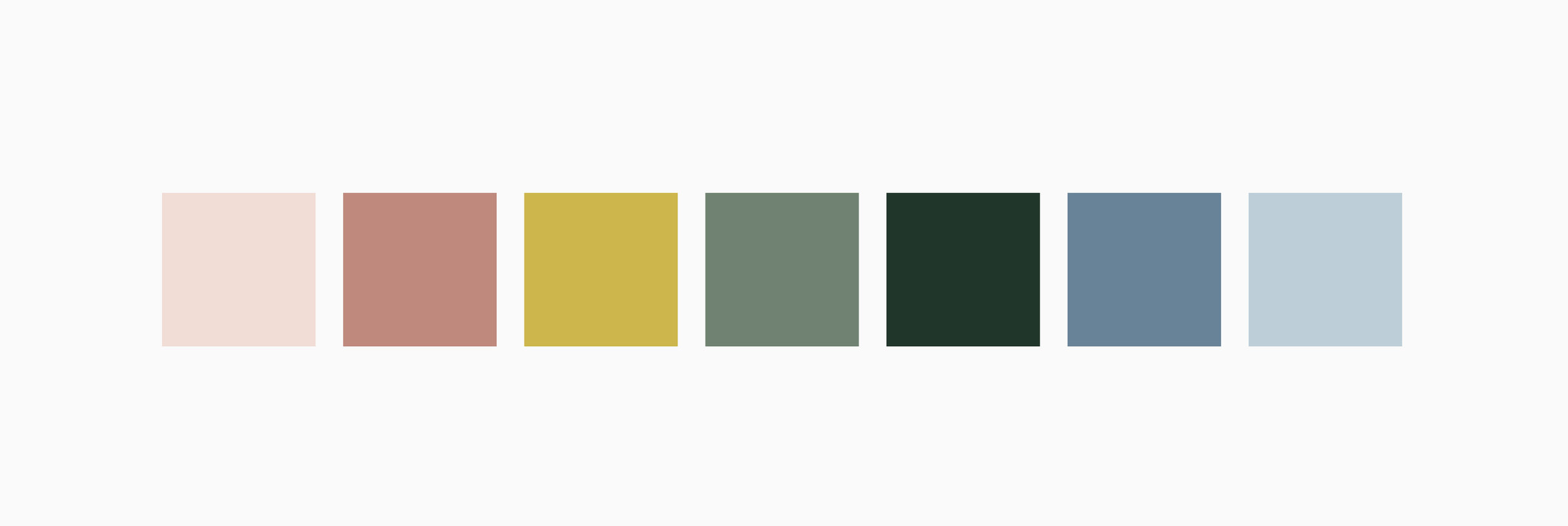
The brand ideation and research phase involved trend forecasting, color matching and Pantone selection, image development and design direction presented to the client in a mood board, all before concept design began.

Custom designed business cards - 2 tone edge, simple split layout with logo + client information

Additional concepts considered during final rounds not selected